BACKSTORY
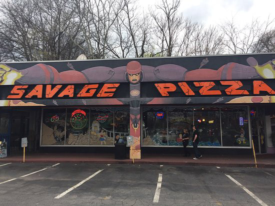
Savage Pizza's Little Five Points location in Atlanta, Ga.
Savage Pizza is one of my favorite places in town due its awesome pizza and its comic book decor.
THE IDEA
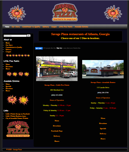
When I looked at the website, it was clear that it needed a refresher. At the same time though, I wanted to keep its old-school comic book shop / pizza joint vibe.
THE LOGO
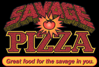
Current Savage Pizza Logo
I love Savage Pizza's logo, it looks just like a Marvel Comics logo from the 80's, but I felt that it was a little busy and not as legible as it could be. So, I took best elements of it and refined into something that was more simple yet still dynamic.
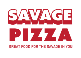
Logo Redesign
THE FINAL RESULT
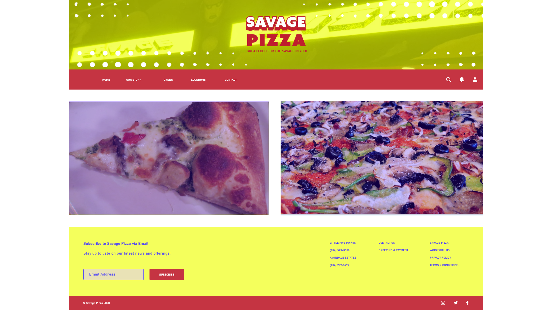
I revised the color palette, removed the information redundancies, and reorganized the website elements.
LESSONS LEARNED / NEXT STEPS
This was a fun little project. This was primarily a UI redesign so next steps would involve reorganizing the site map, fleshing out other pages of the site, and conducting usability testing to see how well the site functions.